Datawrapper is right now the best tool for creating quick and simple charts. It’s so useful and feature-rich that news organizations that had their own in-house charting tool are switching over.
One of its best features is the ability to connect a CSV file hosted on the web as a data source. This enables users to create self-updating charts with regularly-changing data (like Covid cases), since Datawrapper fetches the data at regular intervals (with caveats. More on this later).
This is what I did with the CBC Montreal Covid tracker page: it has seven charts that are auto-updated in different ways.
Here are four ways to create these, from easiest to more technical.
1. Using a ready-to-go CSV
Some data providers might already have a CSV on the web that is regularly updated. If the data is good to go, has only the columns you need, and needs no additional cleaning and analysis, just use it as a data source.
The Public Heath Agency of Canada has a dataset with the daily number of new Covid cases by age group in Canada. It’s one of the many datasets that powers their Covid dashboard.
This CSV is in the format that Datawrapper likes:
- The first row has the column headers
- It’s in wide format, so each series has its own column. In this case, we want one line per age group, so each age group needs to have its own column.
In Datawrapper, you can simply take the URL to that data and paste it in, under “Link external data”:
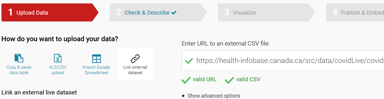
BE A GOOD INTERNET CITIZEN: Datawrapper will connect to the data’s URL every minute (more on this below). When linking directly to a data provider, will make sure they can handle the load. In this case, it’s a government website that was made to handle high traffic. When in doubt, ask.
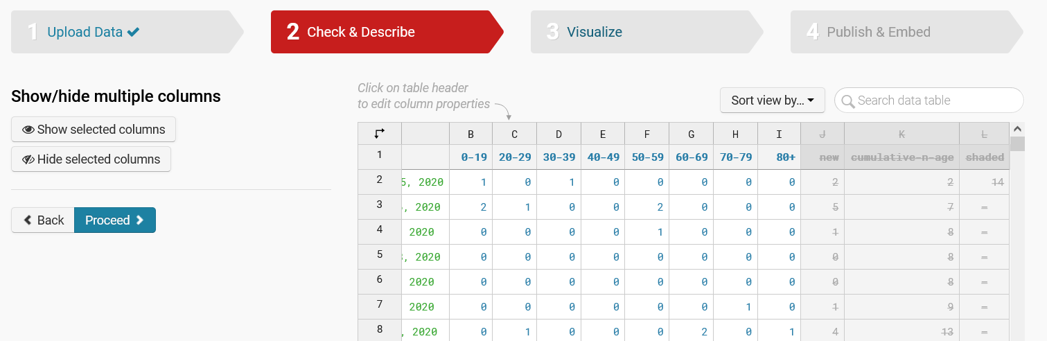
On the next step, “Check & Describe” you can make sure the data looks good and exclude columns from being drawn by selecting them and clicking on “Hide selected columns”:
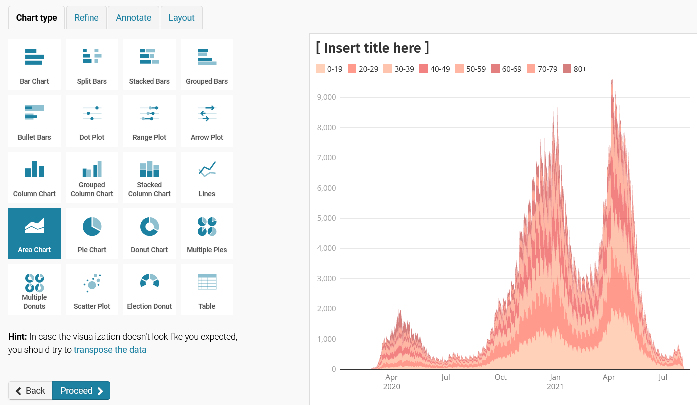
Et voilà, now you just select the chart type, style it as needed, and publish:
About those caveats…
Datawrapper will look for new data every minute within the first 24 hours after the chart was published, then every hour for the next 30 days. So it’s not a perpetually self-updating chart. You’ll need to republish it every now and then to reset the update frequencies and to make sure it remains up to date.
Read more caveats about self-updating Datawrapper charts here.
2. Use Google Sheets to change and publish the data
Not every dataset comes ready to be visualized. In fact, very few do. Most will need some work, like filtering, aggregating, and reshaping before it’s ready for Datawrapper.
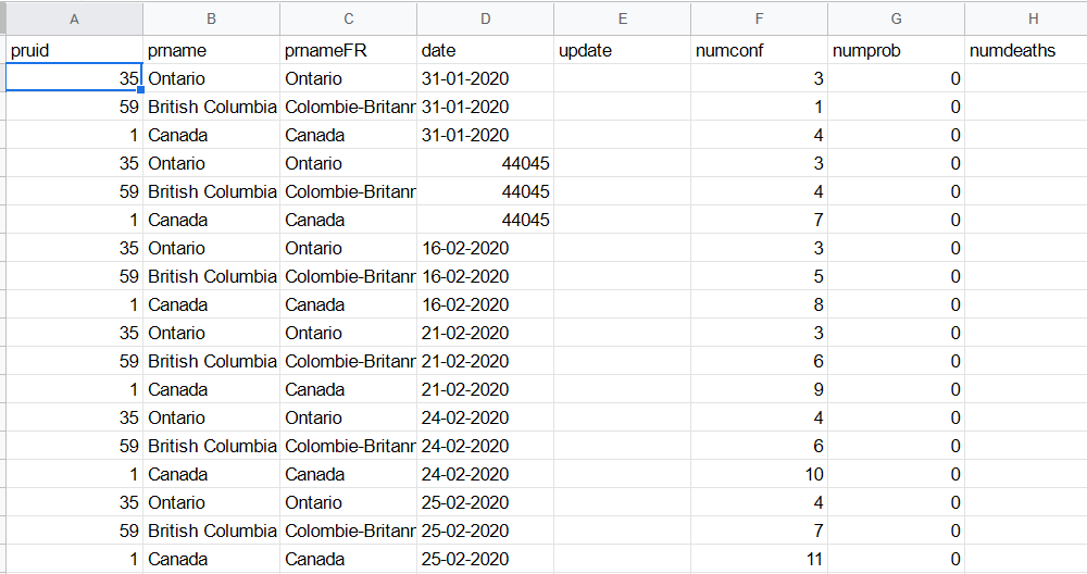
Like this other dataset from PHAC with daily Covid data for every province in Canada. Datawrapper won’t know what to do with it:
- It’s in long (or tidy) format: each series (like provinces) doesn’t have its own column, but are stacked in a single column.
- There are many columns of different types (like numbers and rates). You should only chart comparable data.
Google Sheets comes in handy here, allowing you to:
- Pull in the raw source data
- Filter and reshape it (using a pivot table, for example)
- Publish the refined data as a CSV on the web, which can be plugged into Datawrapper.
Here’s how.
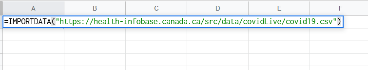
In a new sheet, use the IMPORTDATA formula to pull in data from a CSV on the web. It’s as simple as writing this in cell A1:
=IMPORTDATA("https://health-infobase.canada.ca/src/data/covidLive/covid19.csv")
It may take a while. You’ll see what looks like an error message that says “Loading…” but the table will be populated with the data.
Note: IMPORTDATA will refresh the connection every 15 minutes or so. Remember to be a good internet citizen.
WARNING: Google Sheets may not play well with very big datasets and throw errors, or say that a limit has been reached. Also, if Datawrapper looks for new data as Google Sheets is “Loading…” you chart will come out blank.
The data might need some love, for instance, setting the columns types (look at the date column below as an example).
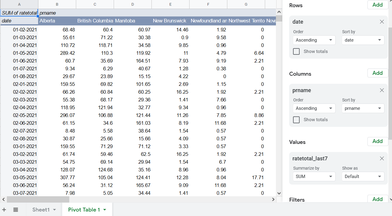
I only want the 7-date rate of cases for provinces, so in a new pivot table, I add date as rows, prname as columns, and ratetotal_last7 as the values. I also add two filters, one for date, only showing values since Jan. 1. 2021, and one for prname to exclude numbers for all of Canada and for repatriated travellers.
Now you have a dataset ready for Datawrapper.
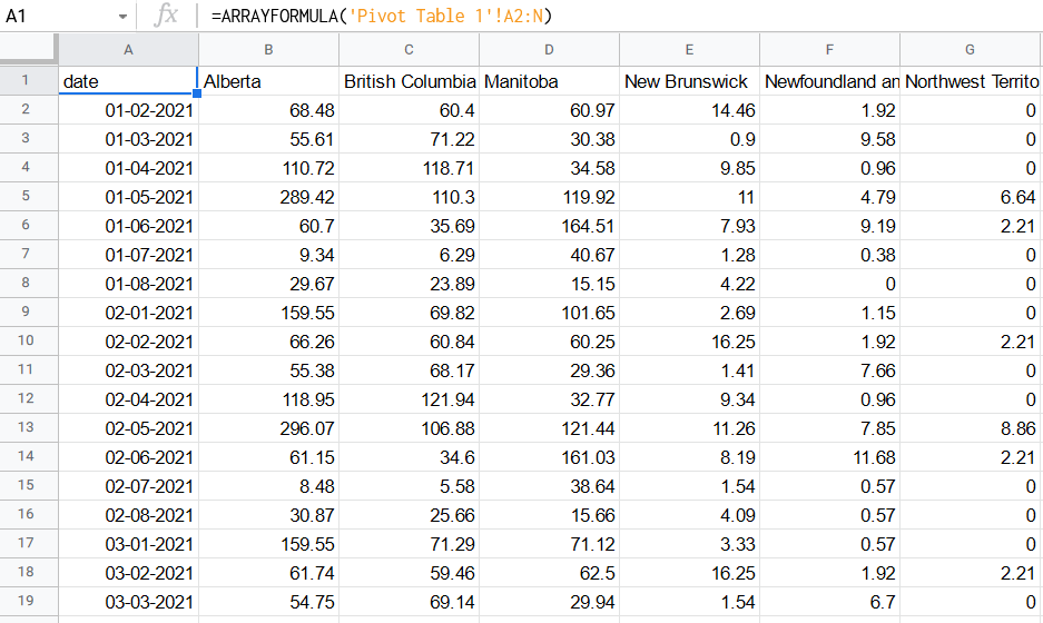
Well, almost. Datawrapper needs the first row to the the column titles. Pivot Tables adds a description of the pivot as the first row. This will confuse Datawrapper. So you need to create another sheet based on this table without that first row.
This is easy using an array formula. In a new sheet, on cell A1, enter the following formula:
=ARRAYFORMULA('Pivot Table 1'!A2:N)
This means: Take everything in Pivot Table 1 (or whatever you named that sheet) starting at cell A2, to column N, as far down as it will go. This grabs the whole reshaped data, except for the first row.
The beauty of this system is that all the sheets are dynamically interlinked. So the first sheet is always pulling data from the source, the pivot table filters and reshapes whatever is in that first sheet, and the third sheet takes whatever is in the pivot table, not matter how many new rows are added! It’s a self-updating pipeline!
Finally, you can publish this final sheet as a CSV on the web to pull into Datawrapper:
Go to File -> Publish to the web. Choose only the sheet you want to publish, and choose CSV format.

Copy the link it gives you, and the rest you already know.
3. Use Google Apps Script to automate everything
The two techniques above relies on Google Sheets and Datawrapper to work reliably and seamlessly with minimal intervention. As great as these tools are, they’re not foolproof. Step 2 uses three sheets for one dataset. It’s not efficient. Things may break, bugs may happen. You might hit some kind of limit with Google or have unlucky timing when Datawrapper fetches the data while Sheets is still loading.
To ensure that things work reliably, you’ll need to get dirty with some code. Google Sheets lets you write code that automates these tasks, and you can schedule it to run at custom intervals. This is done using Google Apps Script, which is almost identical to JavaScript.
Let’s say you only want the date and new daily Covid death numbers for all of Canada. The following script will do that (each step is annotated).
In your Google Sheet, go to Tools -> Script Editor to start a new script.
// Create a function and give it a name that will be used later
function getData() {
  // Define the URL of the dataset and request headers
  var url = "https://health-infobase.canada.ca/src/data/covidLive/covid19.csv"
  var options = {
     "method" : "GET",
     "headers" : {
       "User-Agent" : "Mozilla/5.0 (X11; Ubuntu; Linux x86_64; rv:77.0) Gecko/20100101 Firefox/77.0"
     }
   };

  // Fetch the data and parse the CSV
  var data = UrlFetchApp.fetch(url, options).getContentText();
  var csv = Utilities.parseCsv(data);

 // Specify which columns you want. In this case, it's prname, date, and numdeathstoday
 // Those are columns 2, 4 and 20, or array indexes 1, 3, and 19
  var requiredColumns = [1, 3, 19];

 // Keep only the columns specified
  csv = csv.map(r => requiredColumns.map(i => r[i]));

  // Create an empty array that will house your filtered data
  var filteredData = [];

  // Take the first row of the raw CSV as the column headers
  filteredData.push(csv[0]);

 // Loop though each row of the raw CSV and if the first column is "Canada", push it to the filtered array
  for (var i = 1; i < csv.length; i++) {
    if (csv[i][0] == 'Canada') {
      filteredData.push(csv[i]);
    }
  }

  // Insert the filtered data into a sheet that you've named "Canada deaths"
  var sheet = SpreadsheetApp.getActiveSpreadsheet().getSheetByName("Canada deaths");
  // Clear the sheet of any content that was there
  sheet.clearContents().clearFormats();
  sheet.getRange(1, 1, filteredData.length, filteredData[0].length).setValues(filteredData);

}
Save it and run it to make sure it works. You may be asked to authorize the script to access your Google Drive. Check your sheet to see if the data has been added correctly.
Yes, it’s a lot of code for a simple task. But there is really no other way (that I know) without setting up a script on your own server.
Now that you have a script ready, you need to set a trigger for it to run according to your schedule.
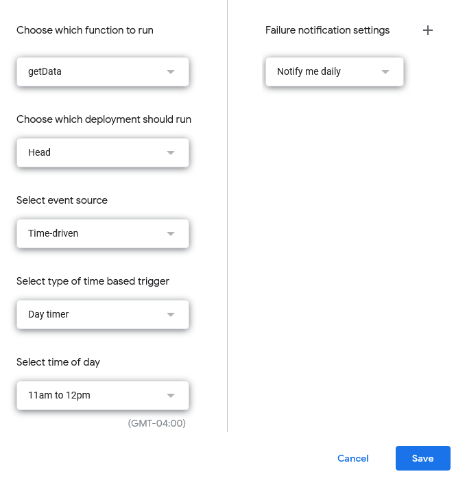
In the Apps Script console, go to Triggers (the little clock icon) and click “+ Add Trigger”. Choose the function name you created getData, choose event-source as “Time-driven”, and since Covid data is updated once a day, choose “Day timer” at a reasonable hour.
Save it and you have a daily bot that is guaranteed to get only the data you want in one sheet!
The rest is easy: publish the sheet as CSV and pull into Datawrapper.
4. Deploy your own Python script using the Datawrapper API
By far the most powerful, reliable, and flexible way to auto-update Datawrapper charts is to write your own code to fetch, transform and push the data without having to use Google Sheets. Datawrapper has a Python library that makes it a snap to update charts using a pandas dataframe
If you’re read this far, you probably know all this jargon, so here’s what to do.
Make sure you have pandas and the datawrapper libraries installed and that you have a Datawrapper API token. See instructions here.
Also make sure you already made a chart with the data you want to update and that it’s styled to your liking. Note its unique ID, which is in the URL of the Datawrapper website:
https://app.datawrapper.de/chart/CHART-ID/visualize
The following code will fetch the Canadian Covid data, filter just the provinces, pivot to wide format, and push the update to Datawrapper:
import pandas as pd
from datawrapper import Datawrapper

DW_TOKEN = 'YOUR-DATAWRAPPER-API-TOKEN'
CHART_ID = 'DATAWRAPPER-CHART-ID'
DATA_URL = 'https://health-infobase.canada.ca/src/data/covidLive/covid19.csv'

def main():
    # Autheticate into Datawrapper
    dw = Datawrapper(access_token = DW_TOKEN)

    # Get latest data as a pandas dataframe
    df = pd.read_csv(DATA_URL, parse_dates = ['date'], dayfirst = True)

    # Filter out Canada totals and repatriated travellers
    df = df[~df.prname.isin(['Canada', 'Repatriated travellers'])]

    # Pivot so it's one province per column, using the ratetotal_last14 column as values
    pivoted = df.pivot_table(index = 'date', columns = 'prname', values = 'ratetotal_last14')

    # Add the data to the proper Datawrapper chart and publish
    dw.add_data(CHART_ID, pivoted)
    dw.publish_chart(CHART_ID, display=False)
Much simpler than using a Google Sheet script!
Now you just need to run it on a schedule. I suggest creating a crontab if you have a computer that’s always on, or running it from a serverless cloud app like AWS Lambda, triggered by a daily cron job.
RELATED: Deploying a scraper on Lambda using Selenium
There is one other way to make self-updating charts in Datawrapper that I didn’t mention. And that is to host the CSV data yourself in something like Amazon S3 or your own server. I’ve never done this, but you can read about it here.